ARABIC CALLIGRAPHY INSTRUCTION

How to improve computer generated calligraphic designs
Instructor:
Mamoun Sakkal


1/5/2002

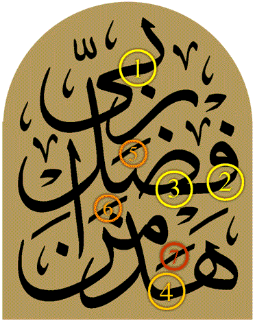
Arabic Computer Thuluth:

With the availability of computer fonts for traditional Arabic calligraphy styles, some designers find it convenient to use these fonts to make calligraphic designs. Such designs will always require manual adjustments to remedy the problems that are imposed by the limitations of the technology.

This example was sent by a designer from Saudi Arabia. It shows some common problems in such fonts:

1. The final "Ya" will always need adjustment to its connection to the pervious letter.
2. The curve of many letters will need adjustment so it flows gracefully to the next letter.
3. the connections to the "Sad" will often need adjustment. While in calligraphy it is possible to control the connection to the previous letter based on how high or low such letter is located in relation to the "Sad", computer fonts limit such connections to one position.
4. The same problem happens when the font has one fixed connection between two letters that does not work well with the composition requirements. Here for example, there is too much space between the "Ha" and "Dhal" and too little space between the "Meem" and "Noon". This results in unbalanced distribution of shapes in this part of the design.
5 and 6. These two "Tashkeel" marks are not needed for any of the words, so they should be eliminated.
7. The "Kasrah" under the "Meem" is correct, however, I preferred to use a small alef for "Hadha" for better composition.


Original Design


Revised Design

To see both images superimposed on top of each other please click here.

| Calligraphy Instruction | Arabic Calligraphy | Sakkal Home |


© SAKKAL DESIGN .

www.sakkal.com