ARABIC CALLIGRAPHY INSTRUCTION
![]()
ARABIC CALLIGRAPHY INSTRUCTION
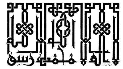
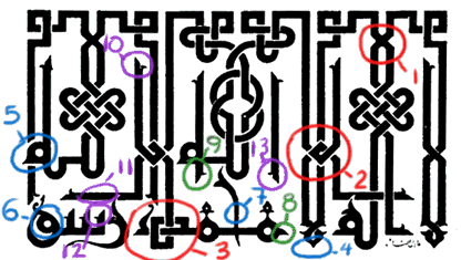
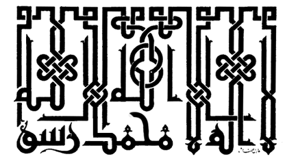
Shahada in Kufi style
Top to bottom: Original design, Notes, and Corrected design
Instructor: Mamoun Sakkal
|
General Comments: The overall layout is very well done. The symmetry is natural, and the distribution of letters is well balanced. The position of the two "Allah" words is well handled, being placed above the other words. Notes and Corrections: 1. and 2. : Brading or interlacing of lines should be consistent in all areas of the design. The interlacing of three vertical lines is usually avoided by leaving one of the three as a free line. 3. Shape of letter "Dal" is not traditional and is confusing because it looks more like "Ha." 4., 5, and 6. : thickness or width of line should be consistent in all areas of the design. It should appear as if drawn with simple strokes of a pen. 7. This shape of letter "Ha" is acceptable, however it seems that a more appropriate shape here is one that fills more of the space and moves away from the word above it. 8. and 9. : These extensions are not traditional or natural. If you want to have an extension before the letter "Meem" then use a Meem drawn above the line which accepts this type of extension. 10. Turning the hook away from the adjacent line gives a more balanced space around it. 11. Raising this horizontal line gives a more balanced space around it. 12. Extending the first tooth of the letter "Seen" gives it a more natural appearance and prevents its confusion with other letter shapes. |
 |
 |
|
 |
| Calligraphy Instruction | Arabic Calligraphy | Sakkal Home |