![]()
© Mamoun Sakkal 2000
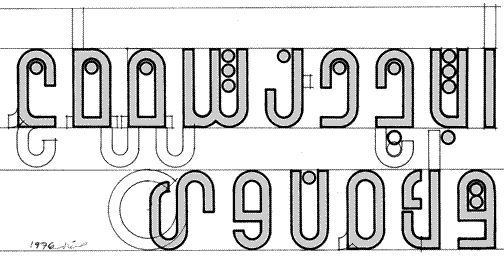
The goal of this concept for a simplified Arabic alphabet was to have a very
uniform appearance in terms of size and shapes. Fearing that the design may
be too minimal, I also allowed a variation with asenders and desendres, indicated
here in light lines, to bring the appearance closer to traditional forms.
Typeface design, 1976, Mamoun Sakkal, Aleppo, Syria.
Phase two of the above concept development. At this stage, compatibility with
English typefaces became an important goal for this design.
Typeface design, 1982, Mamoun Sakkal, Seattle, WA, USA.

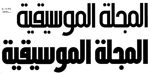
The final design of the typeface Sakkal Shilia. The typeface family consisted
of 4 different weights.
Sakkal Shilia regular, 1982, Mamoun Sakkal, Seattle, WA, USA. See additional
examples.
________________________________________
| Back to Article: A Brief Survey of
Proposals to Simplify Arabic Script |
| Side notes: Comparison of Latin and Arabic scripts | End notes | Bibliography
|
| Arabic Calligraphy |
![]()