![]()
© Huda Smitshuijzen AbiFares 1998
Side notes
1. Shapes per letter
Latin: each letter is free-standing and has a constant shape. Only when
deemed necessary, ligatures are provided as extra to a font's basic character
set.
Arabic: because of their inherent calligraphic nature, letters are often
connected to form a word. They enjoy typical calligraphic attributes of
swashes and ligatures. 7 letters have 2 shapes and 22 have 4 shapes (initial,
medial, final and free-standing) to accommodate their position within a
word and their connection to adjacent letters. So for an alphabet of 29
letters Arabic needs a basic set of 102 glyphs. (fig. A)
![]()
Fig.A - Different variations of the same letter H. From right to left: beginning,
middle, ending and freestanding shapes.
2. The Arabic diacritic dots
Latin: has 26 letters in two sets - 1 for Uppercase letters and 1 for Lowercase
letters - which creates 52 letter shapes (excluding numbers and italics).
Arabic: has 29 letters in one set (no Uppercase letters and no italics).
Out of the 29 letters, some share the same shape and are differentiated
only by the diacritic dots (1 -3 dots above or below). This brings the number
to 18 free-standing letter shapes. (fig. B)![]()
Fig.B - Arabic freestanding letterforms. Detail from a poster/ typespecimen
sheet for the Decotype Professional Naskh font.
3. The use of accents
Latin: accents are used to accommodate various sounds and vowels in some
European languages.
Arabic: small accents above or below letters are used to denote soft vowels
and other phonetic subtleties (mostly indicating grammatical functions).
These were invented to aid foreigners and children in learning Arabic. They
are often eliminated or dramatically reduced in newspapers and most printed
matter for visual simplification and economy of leading space. (fig. C)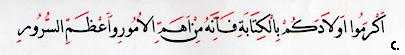
Fig.C - A sentence showing (in red) the soft vowels and consonnant enhancers
as samll accents above the letters. Detail from a poster/ typespecimen sheet
for the Decotype Professional Naskh font.
4. The normalisation of Arabic letterforms
Latin: font design is based on the notion of a set baseline, x-height, capital
height, ascender and descender heights with the horizontal parameters of
each letter in relation to other letters within the alphabet.
Arabic: font design is based on a complex system of measurements per basic
letter shape, more dealing with the letter proportion within a square area
slightly bigger than the letter Aleph (the measuring stick of the alphabet),
the rhombic dot (measured by the pen stroke thickness), and the circle (the
diameter of which is equal to the height of the Aleph). (fig. 9) Arabic
letters hardly ever sit on the same baseline and their ascender and descender-like
parts are of various lengths (with the exception of the geometric Kufi style).
________________________________________
| Back to Article: Arabic
Type: a challenge for the 2nd millennium |
| End notes | Figures
1-5 | Bibliography |
| Arabic Calligraphy |
Author
Huda Smitshuijzen AbiFares is a graphic designer working in France. She
teaches at the Graphic Design program of the American University of Beirut.
She is currently working on a sourcebook about contemporary Arabic type
design and typographers.
This article has been published in Baseline InternationalTypographics Magazine
issue #26 1998 - www.baselinemagazine.com, and reprinted here with permission.
![]()