Part 4 of 5 articles
The Art of Arabic Calligraphy
 

The Cursive Styles

© Mamoun Sakkal 1993, updated 12/27/2016


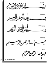
The cursive script dates back at least to the first decades of the Muslim era. The early examples, however, lacked elegance and discipline and were used mainly for secular and practical, rather than aesthetic, purposes. In a slow but continuous process, older styles were perfected, while new styles were invented to meet the demands of different occasions (Fig. 7).

Naskh, which means "copying," was developed in the 10th century, and refined into a fine art form in Turkey in the 16th century. Since then it became generally accepted for writing the Quran. Naskh is legible and clear and was adapted as the preferred style for typesetting and printing. It is a small script 
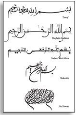
whose lines are thin and letter shapes are round.

Thuluth is a more impressive, stately calligraphic style which was often used for titles or epigrams rather than lengthy texts. Its forms evolved over the centuries, and many variations are found on architectural monuments, as well as on glass, metalwork, textiles, and wood. Mamluk Thuluth of the 14th century was heavy and large, while the Ottomans preferred the simpler more refined version still practiced today.

The traditional classification of the main styles includes in addition to the above Muhaqqaq which is less round than Thuluth; Rayhani which is similar to a small Muhaqqaq; Tawqi which has many ligatures (Fig. 8, line 1), and a miniature version of it called Riqa' used mostly for personal and informal occasions. All these styles are now obsolete and rarely used.

Nastaliq developed in Iran in the 14 th and 15 th centuries. It is the most fluid and expressive of the scripts presented here, and is used extensively in copying romantic and mystical epics in Persian. Nastaliq has very short verticals without any "serifs," and deep curved horizontals. It slants to the right in contrast to all the other styles which slant to the left (Fig. 7, line 4). Still a more dynamic version of Nastaliq is called Shikasteh (broken in Persian) where many spontaneous and uninhibited strokes animate the calligraphic composition (Fig. 8, line 4).

Riq'a, the simpler style of everyday writing is very economical and easy to write (Fig. 7, bottom). It replaces the above mentioned Riqa', and is popular for writing both Turkish and Arabic. Other original contributions of Ottoman calligraphers include the development of Diwani used originally as a chancery hand, and Jali Diwani which was used to write Ottoman fermans, berats, and mensurs (proclamation scrolls, Fig. 8, bottom).

In North African and Muslim al-Andalus, the preferred styles are the Maghribi (western) and Andalusi which retain much of the qualities of Kufic but with more flowing and cursive lines and delicate rather than heavy proportions and forms (Fig. 8, line 2). A heavier version of this script, known as Sudani, developed in Sub-Saharan Africa (Fig. 8, line 3).

There are still many other styles used in different places and times that can't be all mentioned in this limited space, but they combine to form a fantastic wealth of artistic creativity and ever renewing vigor.

Article and figures © copyright 1993by Mamoun Sakkal, updated 12/27/2016

Arabic calligraphy cursive styles


Fig. 7. Samples of Cursive Styles of Arabic calligraphy. From top to bottom: Naskh, Thuluth, Muhaqqaq, Nastaliq, and riq'a.

art8

Fig. 8. Samples of other styles of Arabic calligraphy. From top to bottom: Tawqi’, Maghribi Andalusi, Sudani, West Africa, Shikasteh, Jali Diwani.

Click on image for details

These articles were prepared for Seattle Art Museum's Educational Resource Room, and can be adapted to accompany Arabic and Islamic calligraphy exhibitions at other museums as well.


Part 1 | Part 2 | Part 3 | Part 5 (New)


SAKKAL DESIGN