ARABIC CALLIGRAPHY INSTRUCTION
![]()
ARABIC CALLIGRAPHY INSTRUCTION
How to design
Full Square Designs in Square Kufi
Instructor: Mamoun Sakkal
|
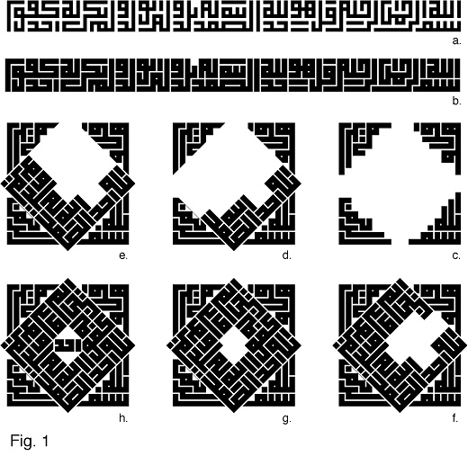
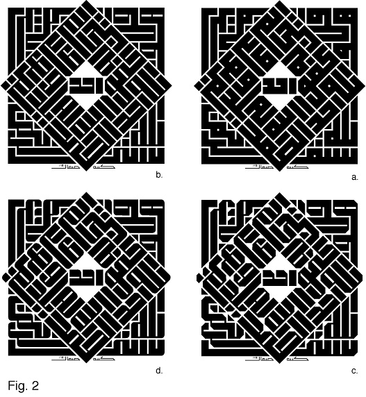
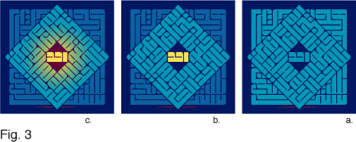
Square Kufi This is a more complex composition for the same Surat al Ikhlas shown in Figure 5 of the previous lesson, Square Square Kufi Designs. Here the text is composed in a more dense arrangement with two words on top of each other in each line (Fig. 1.a.). Here, we have five black lines making up the height of the line of text, compared with four lines used in the example of the previous lesson. Because I plan to use color in this design, I made the lines thicker here to give more impact to the calligraphy (Fig. 1.b.). Instead of composing the text in a square spiral as in the previous lesson, I compose it here in a spiral made of two sections: the first is a square section (Fig. 1.c.), the other is a smaller square that is rotated 45 degrees in relation to the first (Figs. 1.d.-1.g.). But because I want the word Ahad (One) to have a special position in the center of the design as a focal point, I rotate it back to the horizontal position with a small space around it to make it stand out (Fig. 1.h.). This is a novel composition by this author that was never used before in Square Kufi. When the design was completed, I felt that a standard Square Kufi was a bit too rigid, and wished to give the design more energy and interest. To do this, I experimented with variations on the thickness of the lines (Fig. 2.b.), then added some variations on the treatment of the line corners (Fig. 2.c.), and finally chose to use the line thickness variation with rounded line corners (Fig. 2.d.). I chose a color scheme based of blue and made the calligraphy in light blue over a dark blue background (Fig. 3.a.). In order to make the composition components more visible, I made the outer square calligraphy a little darker, and made the word Ahad in the center yellow so it will stand out well (Fig. 3.b.). Finally, I added a yellow graduated fill to the light blue calligraphy as if it is illuminated by the light of Ahad, and added a red graduated fill to the background to allow for more harmony between the word Ahad and the background (Fig. 3.c.). This completed the design which is available for sale as a limited edition calligraphy print. The final notes given in the previous lesson are quite important, and thus repeated here. Because the design should fill the complete area without remains or gaps, you must modify the letter shapes to fit in the allocated space, an effort which requires accurate calculations, sensitivity, and good taste. Never bend or change the letter form to the point where it looses its traditional recognizable form, or in a way that would confuse it with another character in the alphabet. For additional examples please see Square Kufi Square Designs lesson. |
|
|
|
|
 |
| Calligraphy Instruction | Arabic Calligraphy | Sakkal Home |